
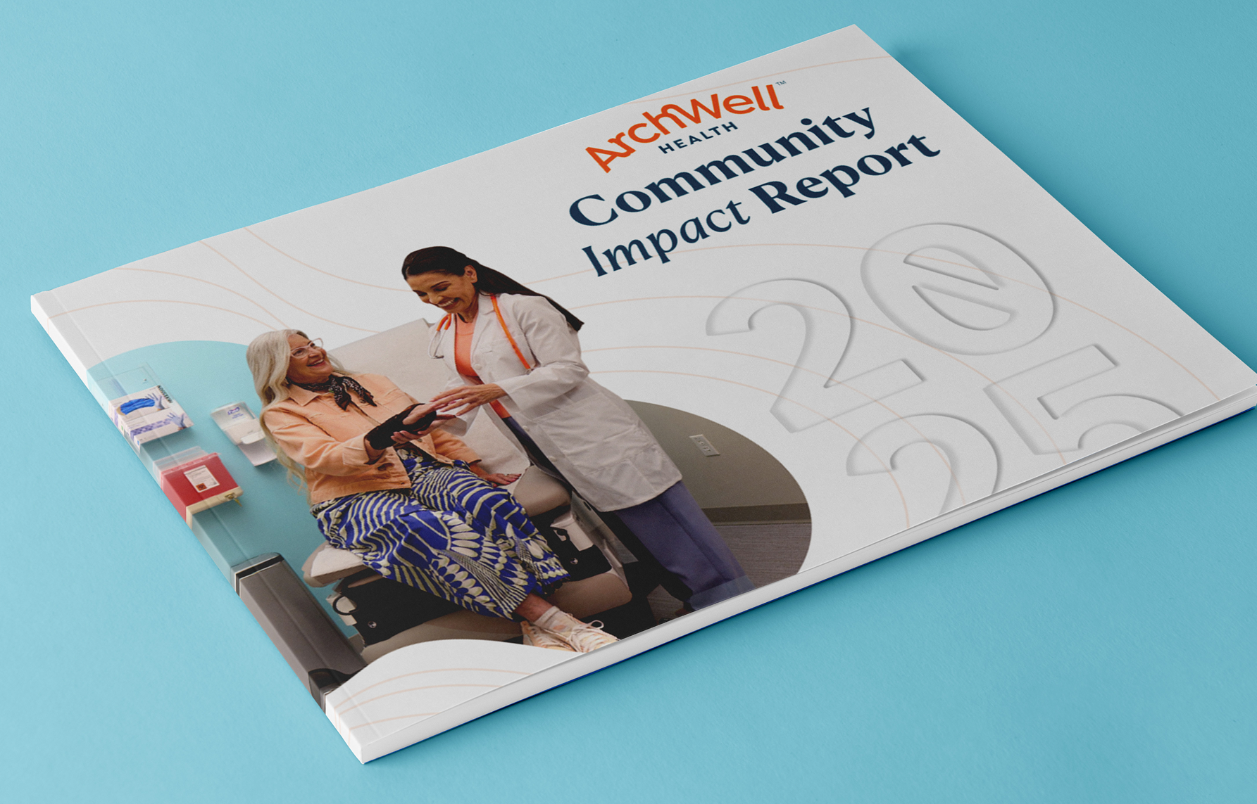
We built upon the design system we previously developed for ArchWell Health to appeal to adults ages 60 and older. That meant prioritizing clarity, readability and ease of use at every step.The typeface, Atkinson Hyperlegible, was designed by the Braille Institute to improve readability for people with low vision. Headlines are easy to navigate. Body copy is set larger to reduce strain.The color palette balances warm, familiar neutrals with brand-forward tones like orange, soft blues and muted teals.


